Case Study: Redefining the UX Strategy for a Core Document Editor.
A strategic initiative to eliminate UX debt in a core document Editor, resulting in a unified architecture that accelerated key user flows by up to 6x and was ultimately adopted by the business.
Project Overview
- Role: Senior Product Designer (Co-owned the initiative with two Product Managers)
- Team: Design Lead, VP of Design, CTO
- Timeline: 6–7 months
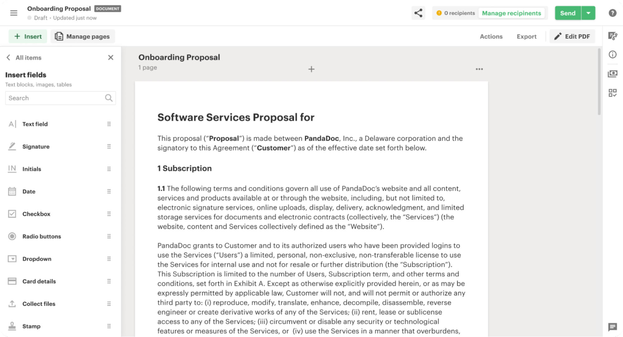
- Context: PandaDoc’s core document Editor had grown organically over several years, resulting in severe feature bloat and fragmented UX. Without a unified "North Star," cross-functional teams were shipping updates in silos. This feature-factory approach meant every new addition fought for primary screen real estate, heavily degrading the core user experience and accumulating massive design and technical debt. The business urgently needed a cohesive Information Architecture (IA) strategy to align future development.
My Role
I initiated and led the strategic design phase of this project. I proposed the comprehensive research plan, executed the vast majority of the operational research, and synthesized the inputs from cross-functional stakeholders. While a dedicated UX researcher joined us briefly for 1.5 weeks to assist with manual data processing, I drove the end-to-end process from initial heuristic auditing to final prototype validation.
1. The Catalyst: Exposing the Design Debt
The initiative began with an observation: we were constantly solving micro-interface problems without understanding how the Editor was intended to expand globally.
To bridge the gap between product teams and leadership, I conducted a comprehensive heuristic audit of the Editor and compiled the Strategic Plan Report. Instead of just pointing out misaligned buttons, I abstracted our accumulated design debt into fundamental architectural flaws:
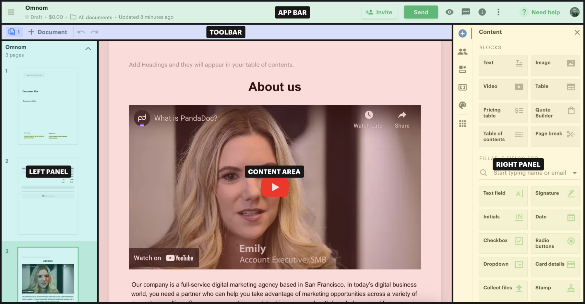
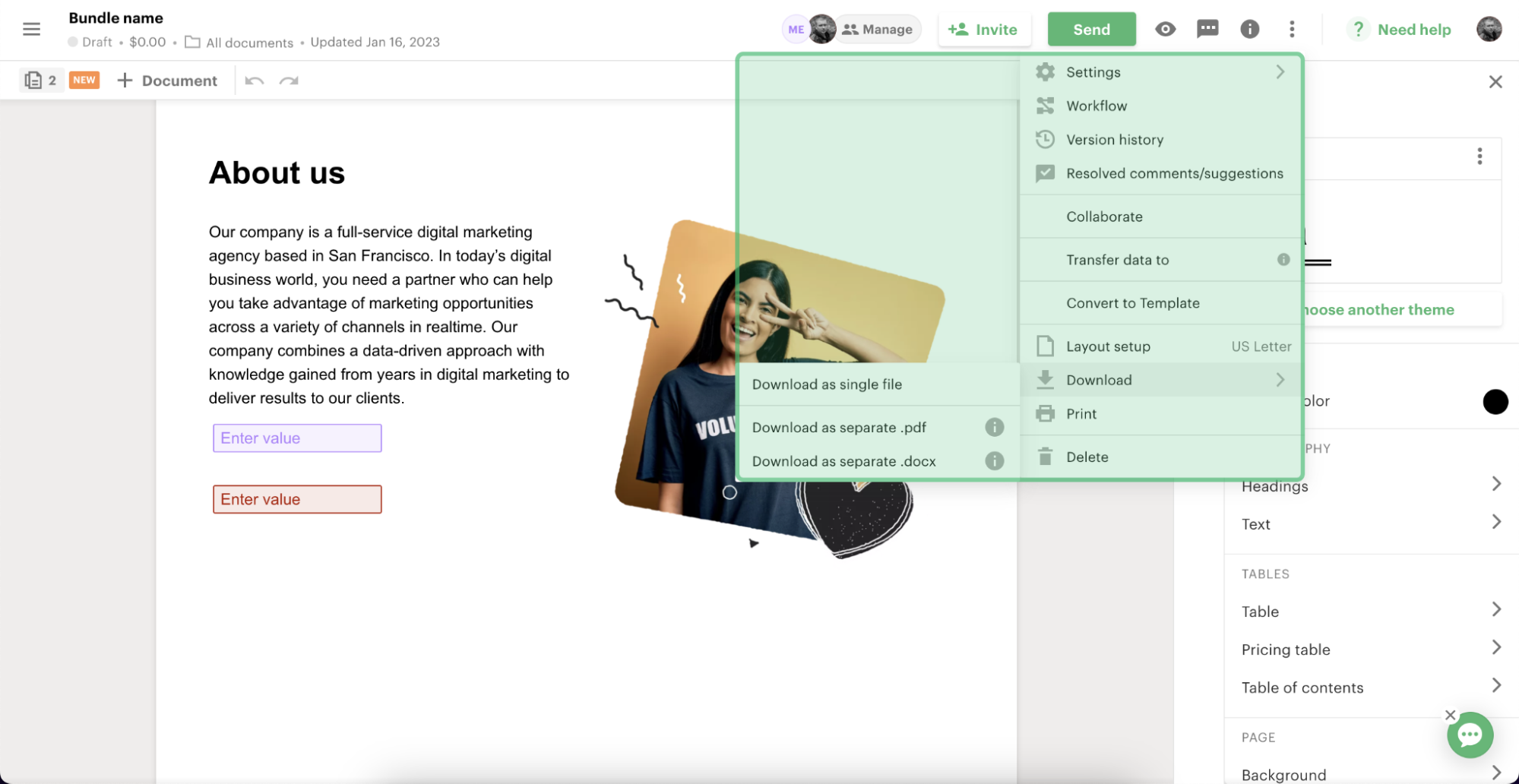
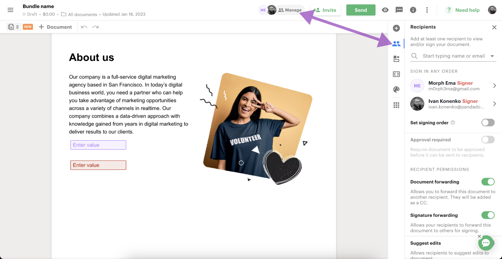
- Fragmented Navigation & "Action Graveyards": Contextual menus and toolbars were highly inconsistent. Critical actions (like document downloading or printing) were buried three levels deep, while secondary workflow settings were unnecessarily duplicated across different views.
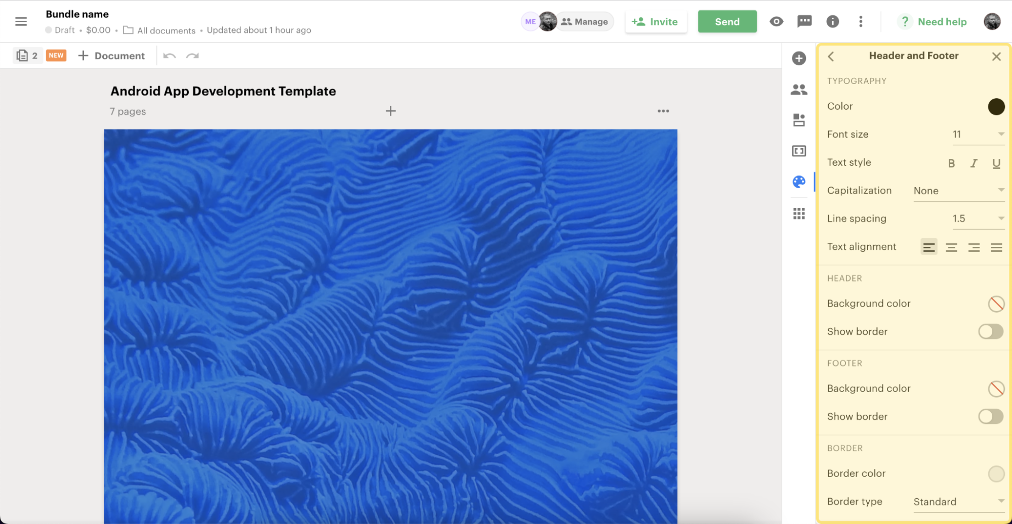
- Contextual Disconnect: The behavior of the right-side properties panel and floating toolbars lacked systemic logic. Users were forced to constantly relearn interactions because property menus behaved entirely differently depending on the content block type (text, image, or checkbox).
- Cognitive Overload: A lack of visual hierarchy and structural consistency meant users frequently struggled to distinguish between entity types (e.g., editing a Document vs. a Template) and misunderstood collaborative states.
The report successfully held a mirror up to our product operations. It aligned the CTO, VP of Design, and Product Managers on the massive scale of the problem and the necessity of creating a unified UX vision.
Read the full Strategic Plan Report (PDF)
2. The Scale of Research (Strategic Discovery)
Leadership acknowledged the systemic issues outlined in the report but requested empirical evidence: how exactly were these structural flaws impacting our users, and what should the new architecture look like?
To provide this evidence, we launched a massive, multi-month discovery phase. We processed an enormous amount of qualitative and quantitative data to build a holistic picture of the Editor's usability:
- Scenario Mapping: We identified and mapped all primary user interaction scenarios within the Editor.
- Pain Point Correlation: We connected real, validated user problems directly to specific functional areas of the Editor.
- Architectural Overhaul: We proposed a newly unified Information Architecture designed to eliminate the duplication of settings, standardize the behavior of the App bar, Toolbar, and Right Panel, and scale cleanly with future feature additions.
The Strategic Pivot: From Monolith to Adaptive UX
At the time, the company’s primary focus was new user activation. Internal data revealed a stark paradox: the vast majority of new users arrived at PandaDoc with a high-intent, immediate goal—they already had a completed document (usually a PDF) and just needed to get it signed right now. They had zero desire to learn a complex editor, play with styles, or explore features they might only need months later.
Paradoxically, this critical activation path was the one we served worst. We dropped these high-intent users directly into a monolithic editor, overwhelming them with an array of advanced, irrelevant features and zero contextual guidance.
To solve this, I proposed a fundamental shift in how we conceptualized the Editor. Instead of a static, one-size-fits-all canvas, the Editor needed to become adaptive and context-sensitive. Starting from a blank slate, customizing a reusable template, or simply processing an uploaded PDF are fundamentally different user intents. Each requires its own tailored, progressively disclosed toolset.
The Ideation Challenge: Designing for Scalability
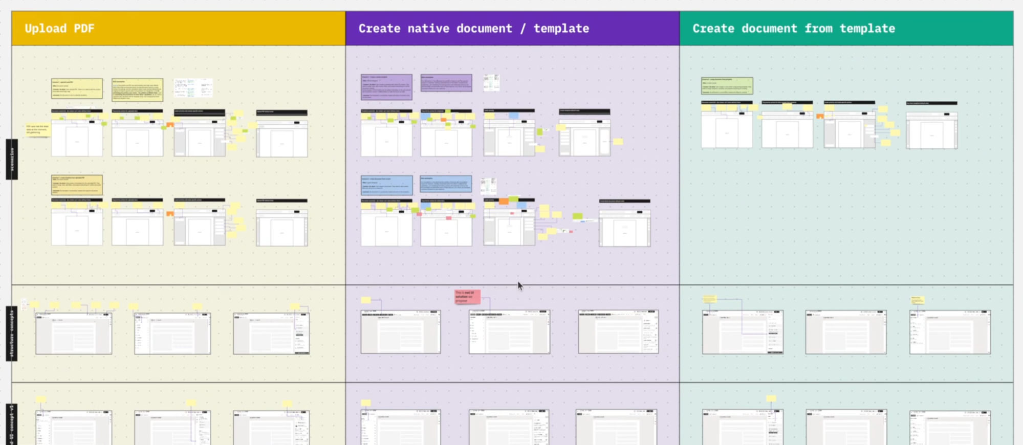
The core complexity of the ideation phase was that we couldn't just redesign the PDF upload flow in a vacuum. To ensure the resilience of the new Information Architecture, we had to map and stress-test all core interaction scenarios simultaneously. Our goal was to build an underlying structural matrix flexible enough to dynamically scale down for a quick PDF signature, yet scale up seamlessly for complex document building, without fragmenting the core codebase or design system.
3. Focusing the Scope: Validation
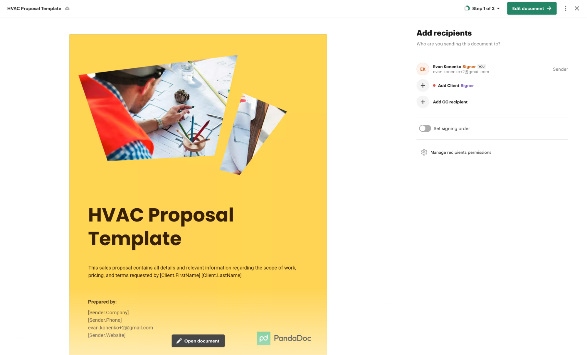
To prove the viability of the new architecture, we focused on one of the most critical and frequent activation scenarios: operations with uploaded PDF files.
I set up a comparative user testing session to evaluate the discoverability of navigation between the current Editor and our redesigned concept. We split new users into two groups and asked them to perform identical tasks on both Figma prototypes.
The data decisively validated our new architectural direction:
- Managing Recipients: The time to check and add document recipients dropped from 25.0 to 16.5 seconds, while the completion rate surged from 50% to 87.5%.
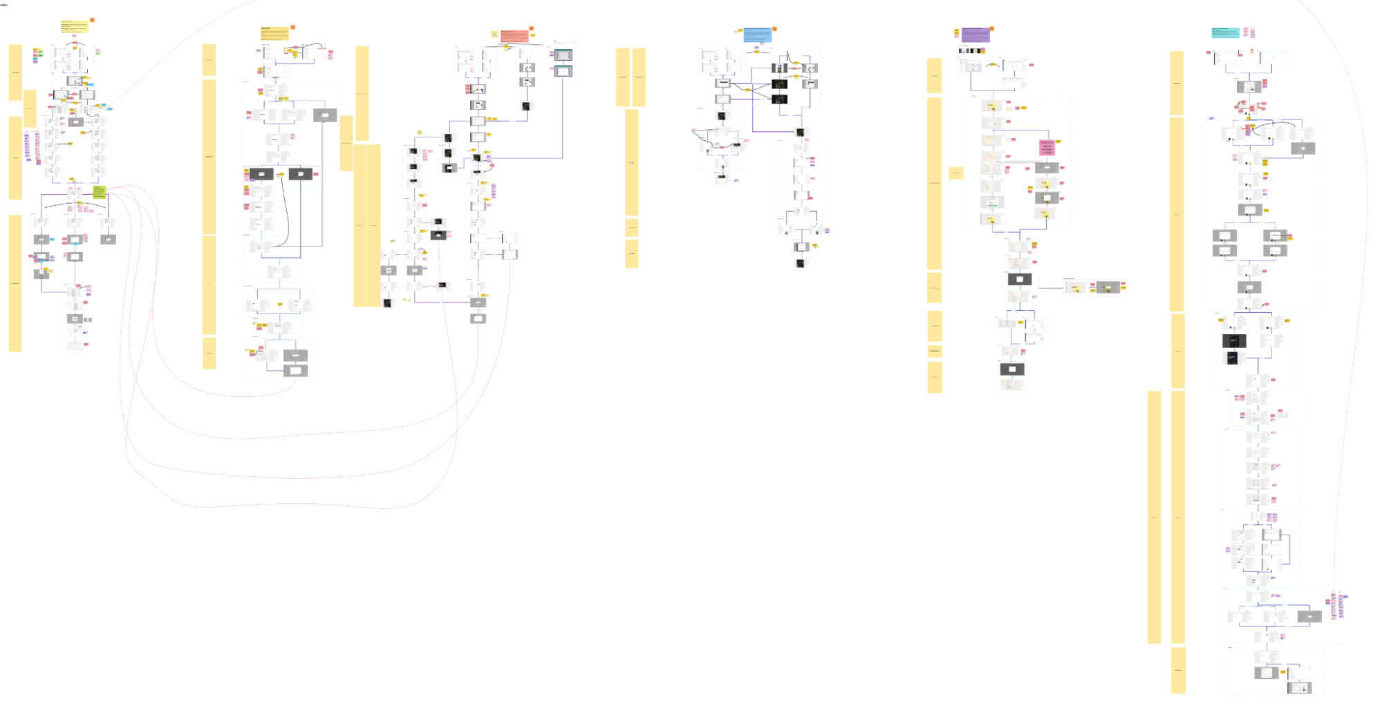
- Link Generation: The time required to generate a sharing link dropped dramatically from 48.6 seconds to just 8.5 seconds (a ~6x improvement).
- Qualitative Feedback: Users noted the new interface was significantly easier to navigate. One respondent highlighted: "Prefers this one. Was more organised, and likes Actions and export... She likes to work from the left, it flows better."
4. Strategic Vision vs. Organizational Readiness (The Outcome)
The Immediate Reality: Despite the overwhelming success in usability testing, the initiative faced an unexpected organizational hurdle. The company entered a period of management restructuring and a shift in short-term priorities. Because the business was simply not operationally ready to implement such massive architectural shifts at that exact moment, the project was put on hold, and I was transitioned to other strategic initiatives.
The Long-Term Impact: A high-quality, evidence-based strategy outlasts short-term organizational pauses. Years after I moved on to new opportunities, I observed that a massive portion of our proposed architectural changes—from the right panel logic to the unified toolbar reorganization—had been successfully implemented into the live PandaDoc product.
This experience served as a profound lesson in product design leadership: winning a usability test is only part of the equation. True strategic design involves building a robust vision that remains valid and actionable when the business finally matures enough to embrace it.
Homepage PD overview.
A high-stakes, strategic redesign of the PandaDoc homepage. This initiative required navigating the technical constraints of a 10-year-old product ecosystem and aligning multiple C-level decision-makers.
- Role: Senior Product Designer (Co-owned with Product Manager)
- Team: Design Lead, VP of Design, System Architect
- Timeline: 4-5 months to first release
My role
I led the initial research and stakeholder alignment to define the strategic direction. By designing and testing multiple approaches, I gathered bulletproof evidence to validate our UX improvements, which directly resulted in the creation of a unified Document Info panel.
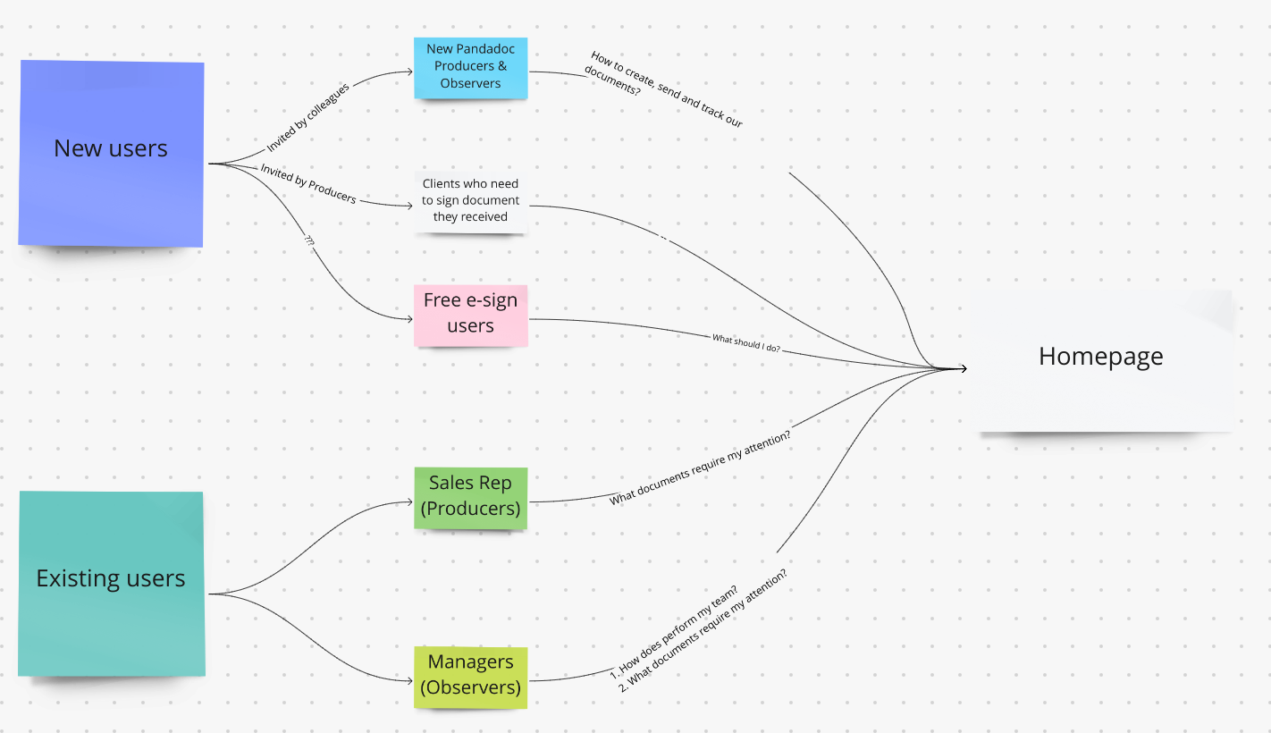
Users
Key Stakeholder Insights
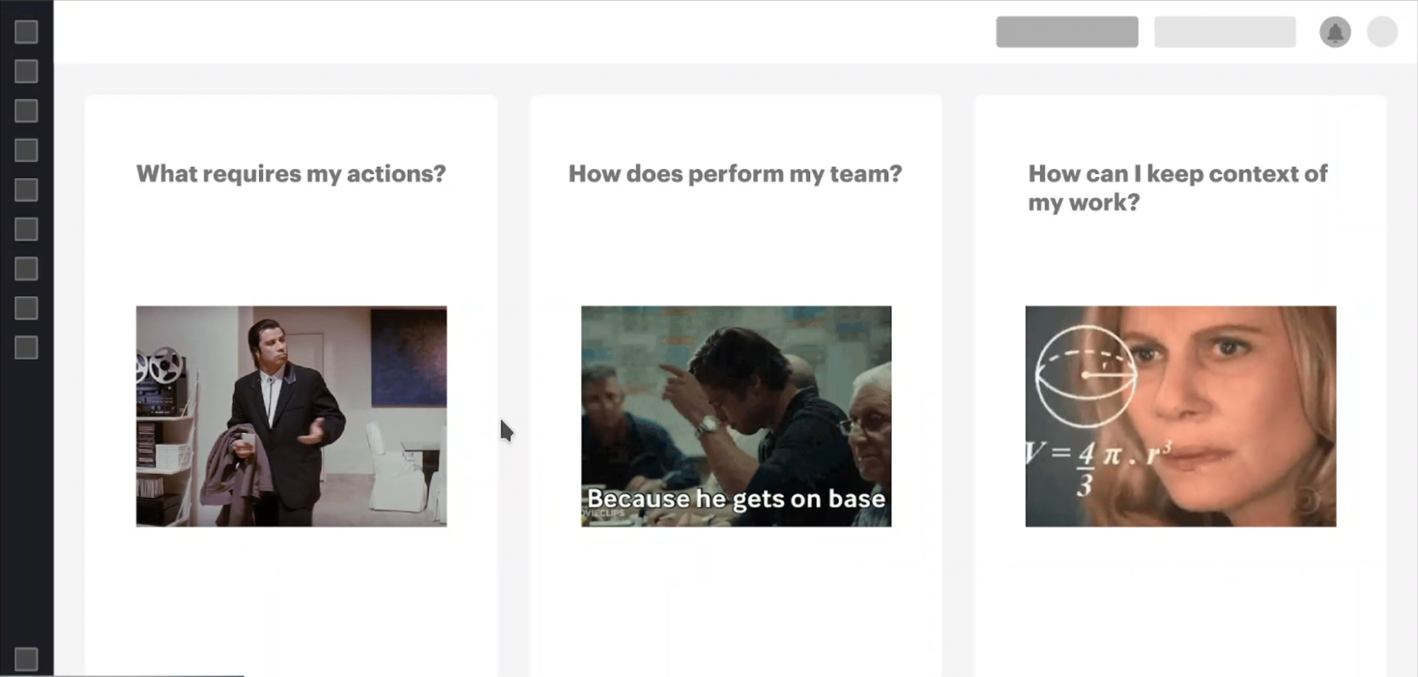
To align our design strategy with business objectives, I synthesized inputs from product leadership into four core directives:
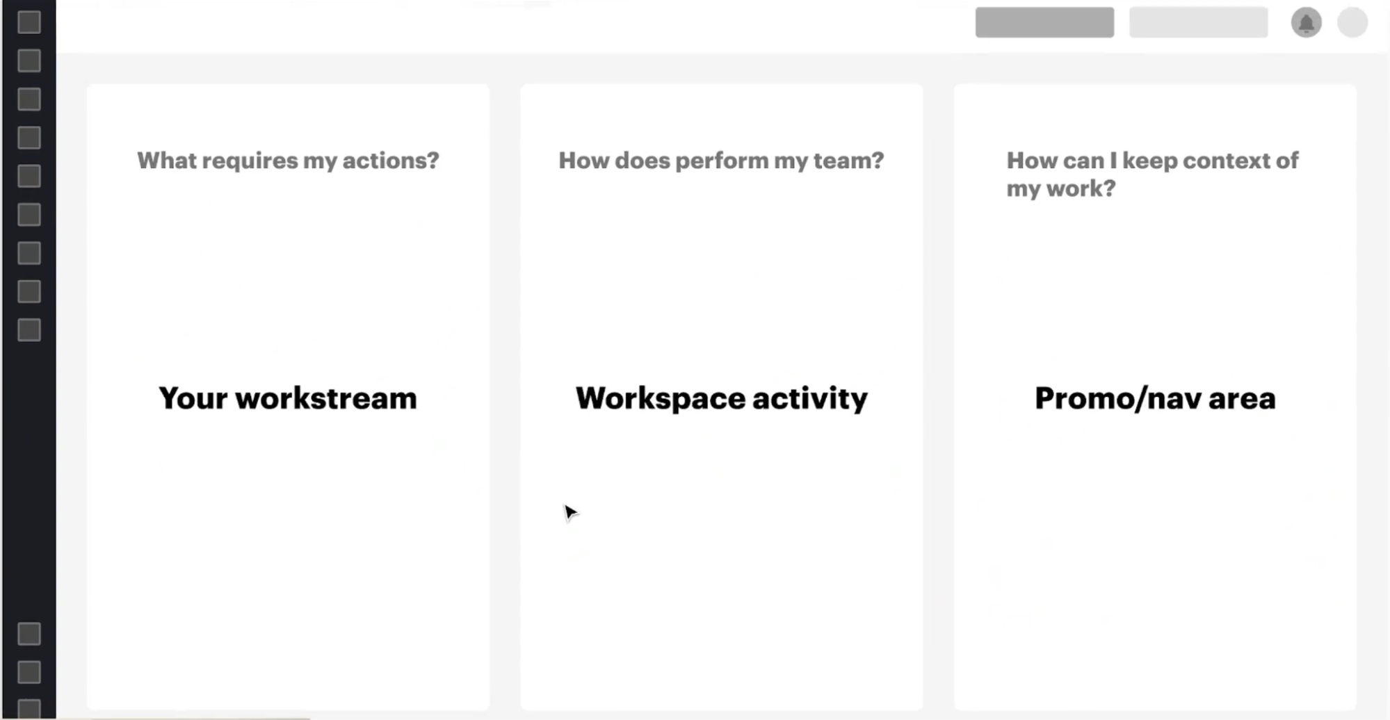
- From Destination to Navigation Hub: The homepage shouldn't be a place where users solve problems directly. It must act as a routing center (Inbox + Notifications) that guides users to their next best action.
- Dual-Audience Focus: The solution must equally serve Sales Reps (Producers) focusing on execution, and Managers (Observers) focusing on team performance, avoiding a strictly sales-centered approach.
- Drive Activation: The primary metric to move is Activation. Instead of dropping new users into empty templates, the system should proactively guide them through creation workflows.
- Document Visibility: Provide clear, immediate answers to: "What is happening with my document?" and "Who is the bottleneck?" without overwhelming the user.
Initial state
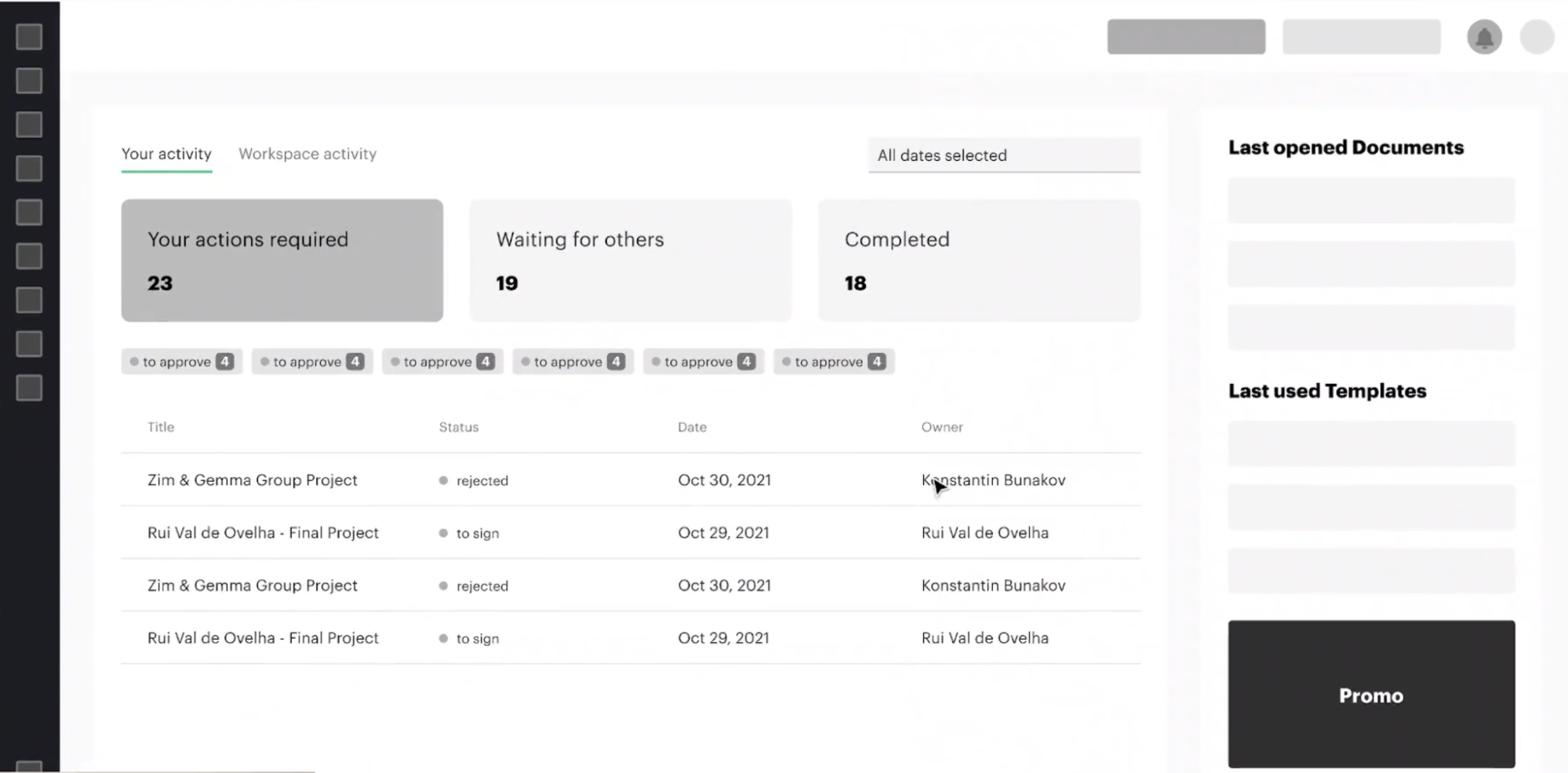
To understand the gap between our new strategic goals and the current reality, I audited the existing legacy dashboard.
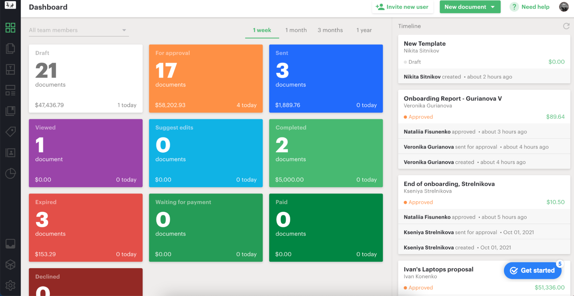
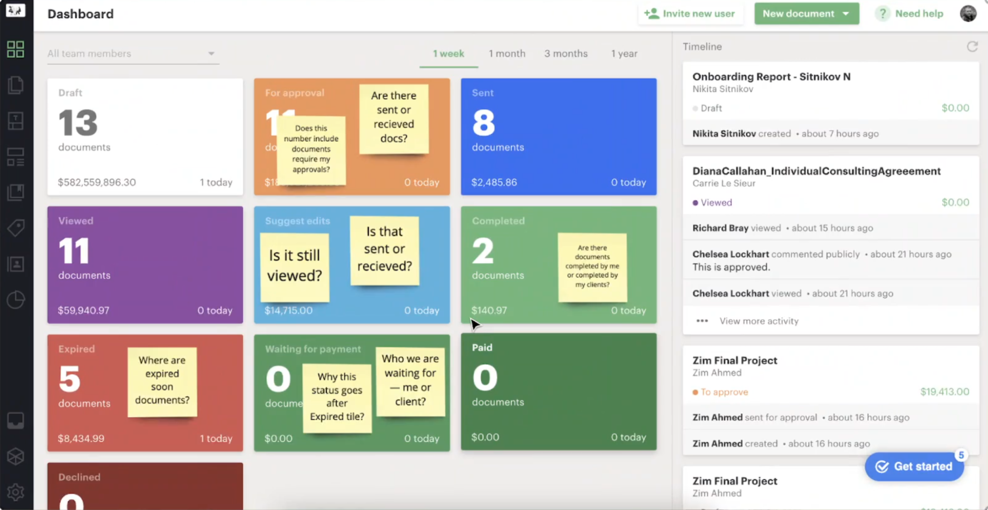
What it does well
- Prominently displays document statuses and amounts of documents. However, we don’t see all existing statuses (some are represented within Inbox only).
- Timeline displays stacked events, which helps keep the context
What should be improved
- Document statuses are displayed as a linear flow, which is simply not true.
- The default view displays Document statuses across the whole Workspace. There is a filter by user, but it requires additional action when we want to check relevant Documents for a particular user (including us).
- There is a massive gap between Workspace statistics and action points for the user who is an actor in a particular workflow (document author, signer). We have a separate Inbox section that slightly correlates with the tile statistics on the home screen.
- It’s not clear what were the used items the user opened during the last session. The current homepage doesn’t help to track personal workflow and tasks effectively.
- Status tiles are represented according to the plan showing almost all statuses. A lot of screen real estate is busy with non-relevant info.
- The Timeline is the one place where we can track events and shouldn’t be used for notifications.
User tasks
I conducted user interviews and analyzed user tickets from our feedback platform. From this research, I identified recurring pain points and mapped them into semantic groups.
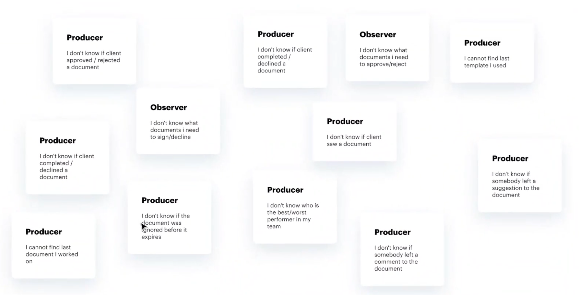
User tasks grouped
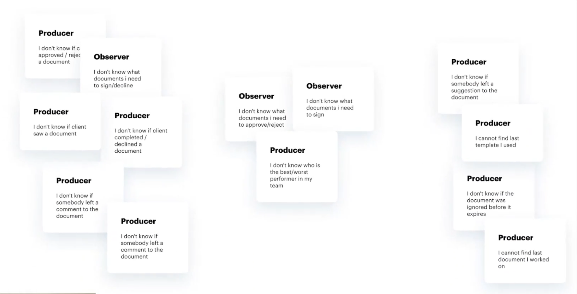
Semantic grouping by sections
Ideation & Spatial Organization
Translating these user pain points into spatial organization, I explored several structural concepts to find the right balance between personal workstreams and workspace activity.
Testing & Validation
I validated the structural concepts primarily through usability testing with existing users to ensure we weren't breaking established workflows. To ensure the new architecture made sense for fresh eyes, I also conducted targeted comparative testing with non-users.
Structure research
V1 was crowded and not clear.
V2 was not scalable due to nested drawers. We already knew we needed a consistent Document Info panel that works and looks the same way across the whole system.
V3 was a more conservative, yet highly scalable approach.
There were more proposals, but all of them required massive changes in the main app sections, so we decided to avoid them.
While exploring dashboard structures, it became clear that we needed a unified way to display document metadata without forcing users to leave the page.
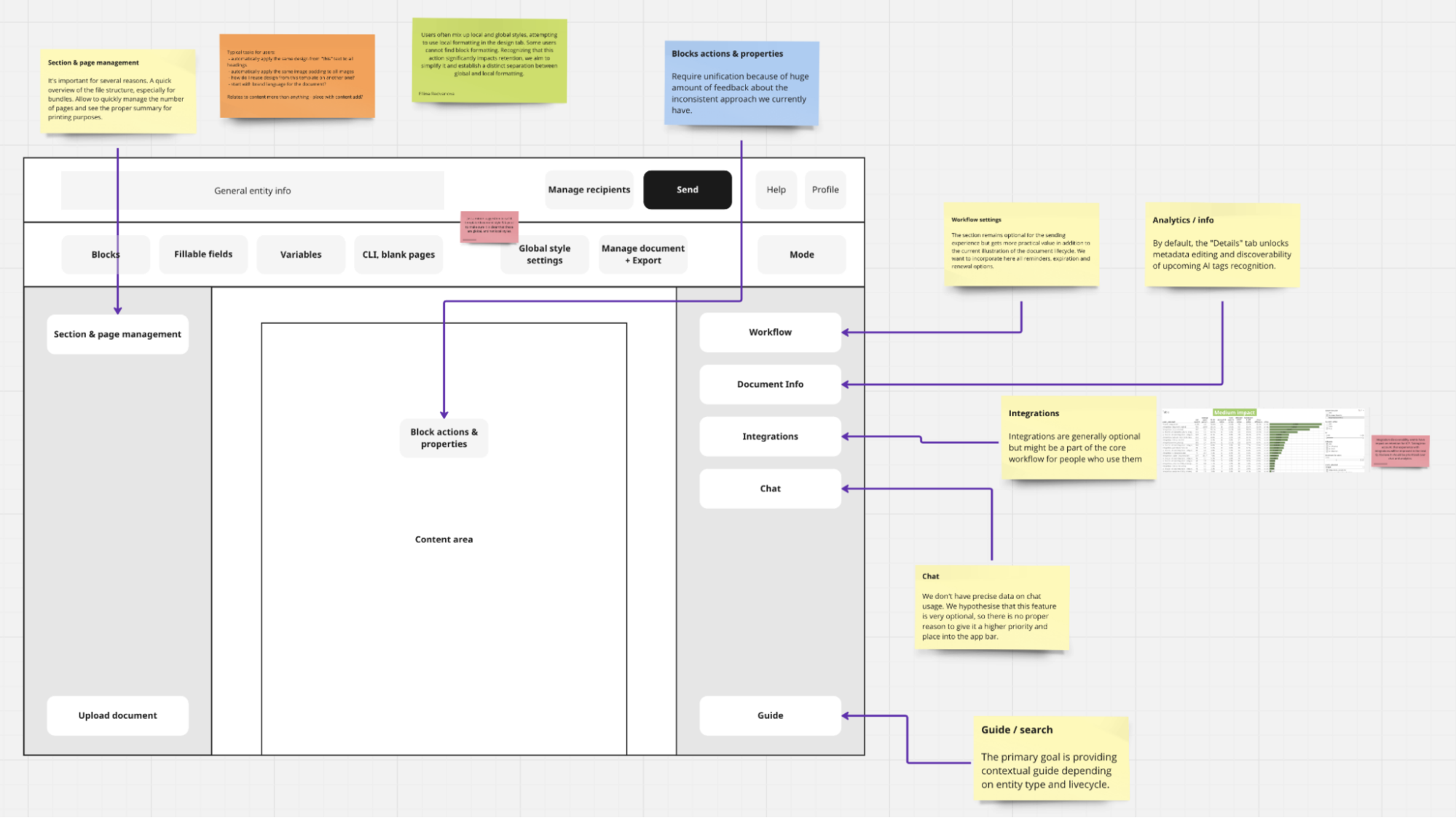
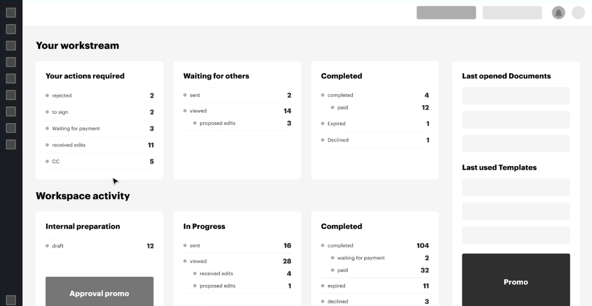
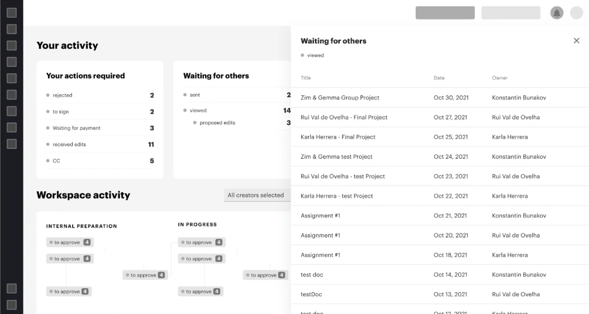
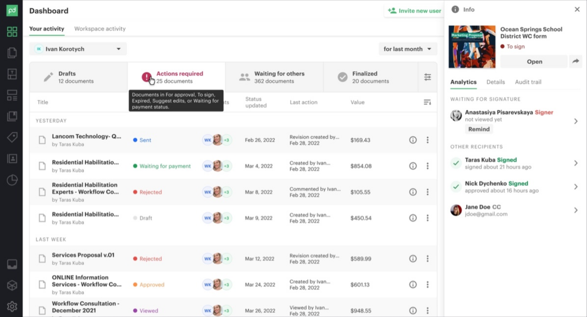
Solving a major friction point: The Unified DocInfo Panel
Previously, users had to fully open heavy documents just to check signing statuses or see who was blocking the process. To solve this, I designed a globally accessible DocInfo panel. It introduced system-wide consistency and allowed users to view activity and execute quick actions without loading the document itself.
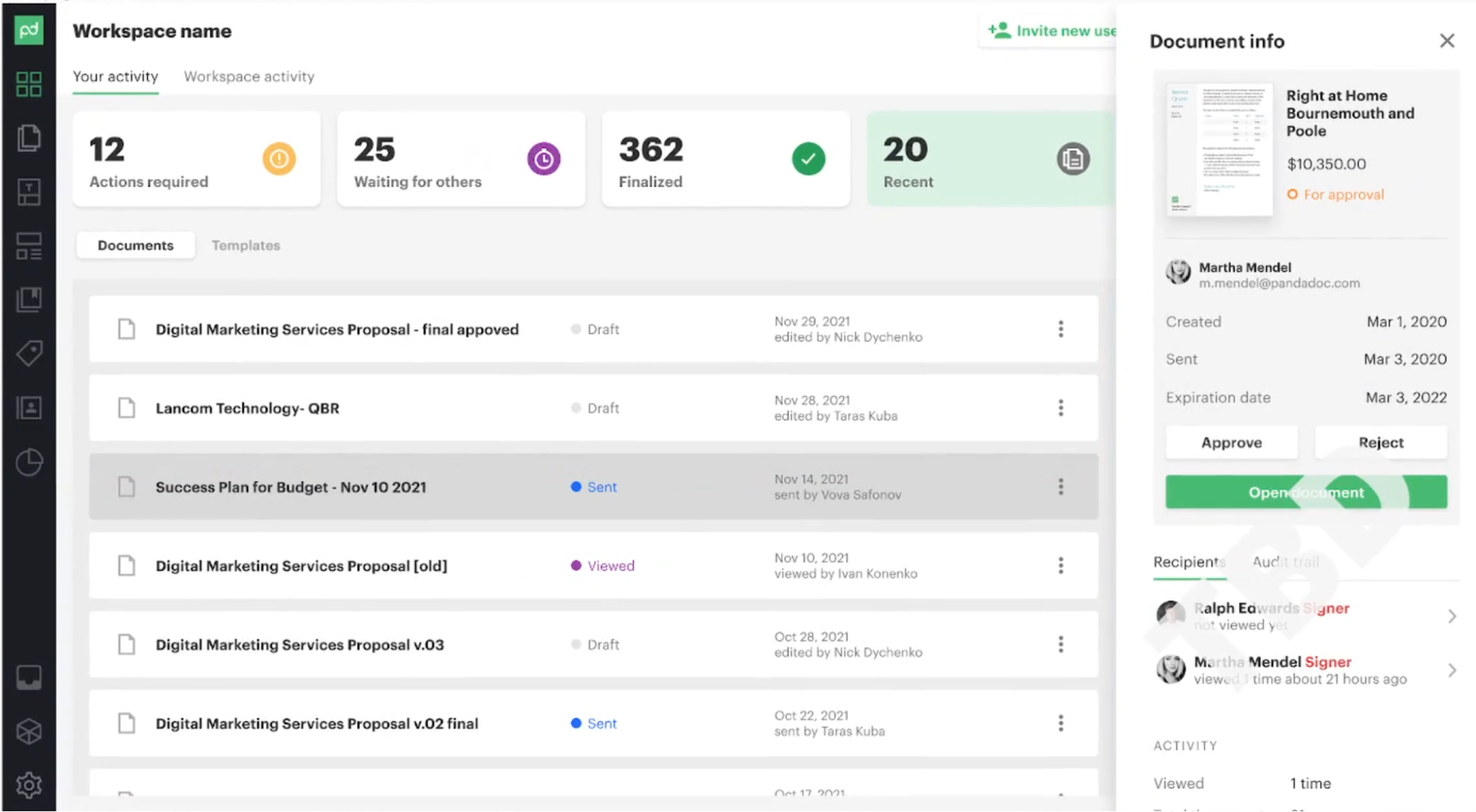
Navigating a 10-Year Legacy
Designing for a mature product required strict feasibility checks. I collaborated closely with system architects and engineers from day one. This ensured we didn't waste time on conceptually beautiful but technically unviable or prohibitively expensive solutions, allowing us to ship complex features like the DocInfo panel efficiently.
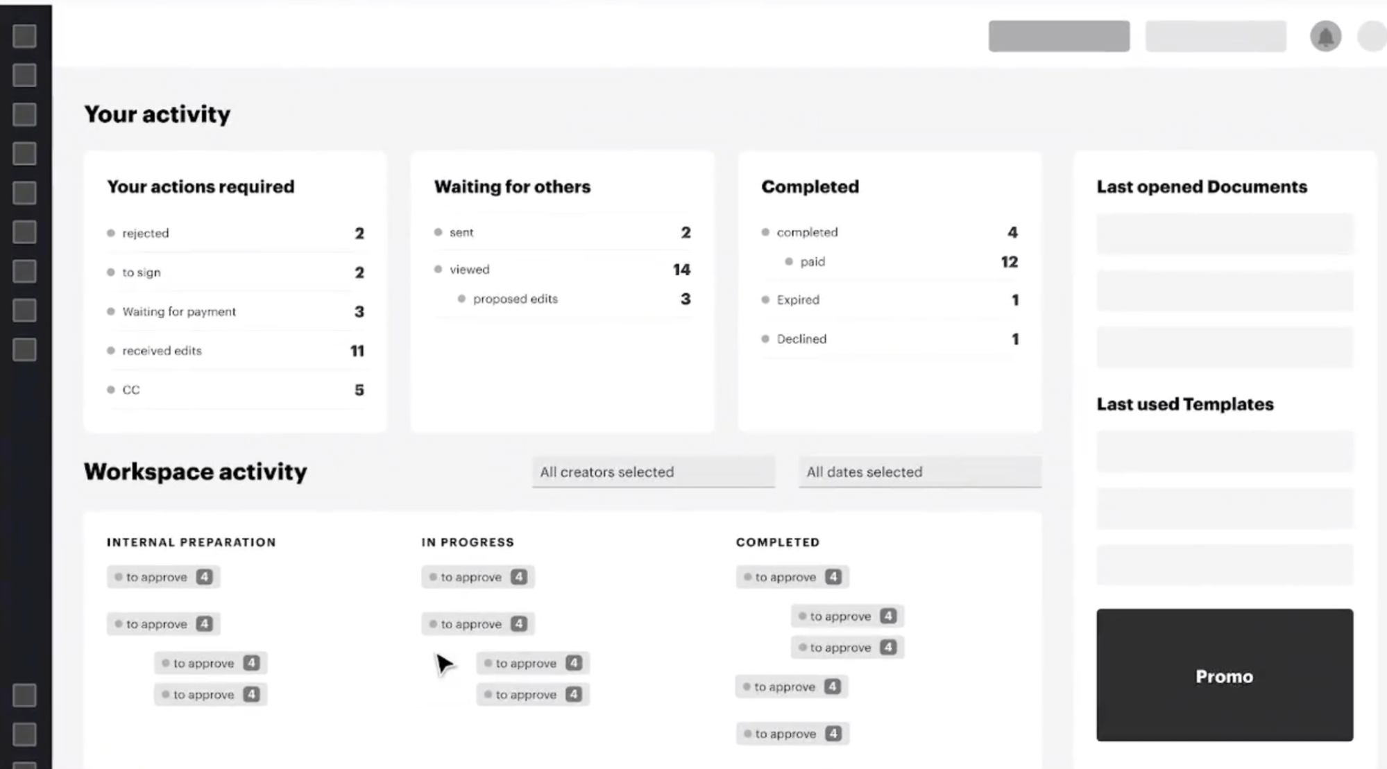
In the next iterations, we applied conventional styles and added flexible settings for document buckets.
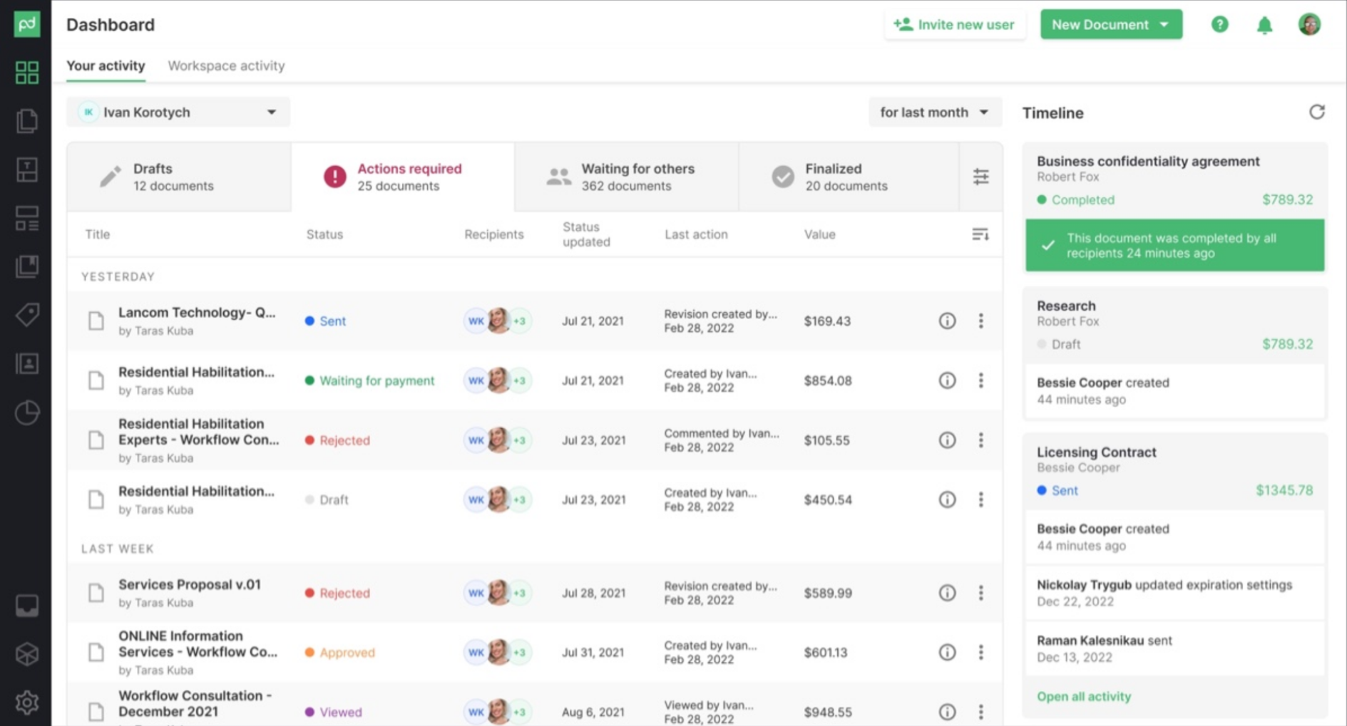
Current state after the UI kit update
Results
+16 NPS among managers
Surfacing manager views prominently increased adoption
47% Q1 Document Info adoption
Among users who previously opened documents only to check status. Reduced system load.
-9 NPS dip among existing users (Managed)
We anticipated a temporary drop in NPS from legacy users due to change aversion. To mitigate this, we intentionally retained the familiar colorful tiles under a secondary "Workspace activity" tab as a fallback. Once users adapted to the new workflow, we successfully moved this legacy view to the Reports section, fully realizing our clean navigation vision.
Reflections & Takeaways
- You can't test everything upfront: While a simplified tab structure tested well initially, long-term usage revealed that users of productivity tools demand control. We eventually adapted the design, adding customizable status buckets that users could toggle based on their specific workflows.
- The cost of "Blue-Sky" thinking: I was initially tasked with reimagining the entire document status system. While valuable for broad exploration, we scrapped this direction because changing core statuses would have broken countless client-side API automations. It reinforced the importance of balancing ideal UX with systemic reality.
- Stakeholder management is a design skill: The biggest challenge wasn't pixel-pushing, but aligning key decision-makers. "Selling" the solution and finding the right balance of assertiveness and compromise was crucial for pushing this 4-month initiative to release.