Hivecell clusters control panel — research and prototyping
To comply with my non-disclosure agreement, I have omitted and obfuscated confidential information in this case study. All information in this case study is my own and does not necessarily reflect the views of Hivecell.
Overview
About company
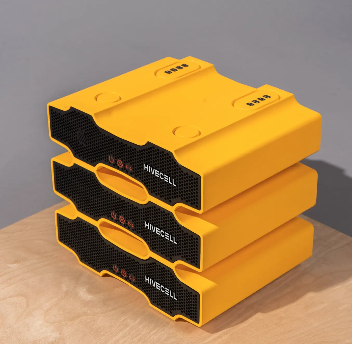
Hivecell is a hardware/software B2B startup that proposes flexible custom computer clusters running necessary software as an alternative for 3rd party cloud services.
It basically means that companies can launch specific software on their own scalable computers. The user can start from one device (Hivecell) and then add up to 7 more computers creating a cluster (Hive).
My role
I was part of a software project to design a control panel providing clear visibility of the client's infrastructure.
Problem statement
Existing clients got provisioned devices with all needed configurations on the firmware level and were able to control devices via SSH.
The primary goal was the control panel creation which provides a general overview of infrastructure health and managing devices.
Users and Audience
Primary product audiences are middle and huge companies with branches located in different locations. For each client, we were aiming for two user groups – technical staff and management. From conversations with existing clients, we have defined high-level needs.
- Managers were supposed to have a general overview and control orders of new devices.
- Engineers wanted to get detailed information about clusters, apply bulk operations and receive notifications about software/hardware issues.
Roles and responsibilities
I led design activities collaborating with two Product Owners, backend, frontend developers and CTO presenting results to founders.
I started in December 2019 and worked until March 2020, handling the research, preparing prototypes and testing interface concepts.
In several months I was involved in the hiring process, helping to find a proper design person for the team.
Process and what I did
Hardware and user research
There is a massive difference between 100% software products and software creation for existing hardware. Even the problem statement phase cannot be adequately done without a clear understanding of the current hardware structure, capabilities, rules, restrictions and plans for future releases.
I’ve started from interviews with product owners and engineers, gathering the information about the device and requests from existing clients.
The primary goal of this step was to fill two abstract bins with information about devices and get an understanding of user needs from all sides. We covered both research directions in parallel.
Hardware dimension
Usually, I’m working on precise information structure when problems are well-described, possible solutions are listed and prioritised. This time it was necessary to change the approach. I’ve described device lifecycle scenarios and created database model descriptions for the cluster and single device.
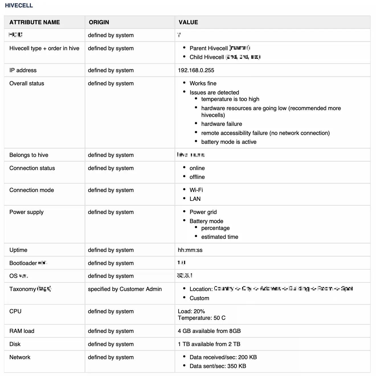
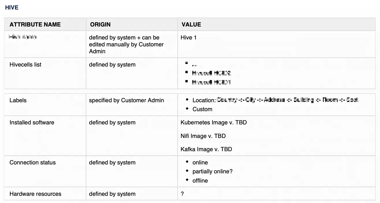
We also created a list of cards describing special requirements and conditions of nodes and clusters functioning. Here are several examples:
- The cluster might have a maximum of 8 stacked devices.
- Device connectors share power and the internet. Each device has an accumulator, which enables immediately if the energy in the power grid disappears. The cluster keeps working because devices are linked via wifi.
- When a new node is added to a cluster, there should be manual approval from the user to prevent data loss.
This information has been constantly updated during further phases.
I should say, using more than 15 years of Linux core-based distributives, managing several home servers and being a huge fan of single-plate computers, I was really impressed how cleverly developed the engineering part. I’m thankful for the chance to work with such enlightened and powerful minds.
User tasks definition
At the same time, we carefully gathered knowledge about user needs, grouping and prioritising them.
Having the information from different people on the client and service side, we created a list of our participants’ tasks.
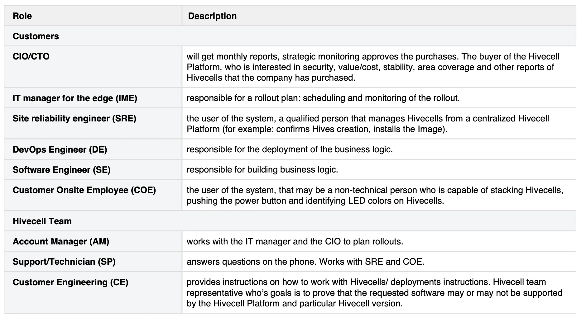
For sure, that was far from the final definition of system user roles. It helped us to visualise the permission levels of different user groups.

Making initial setup and for further troubleshooting, Hivecell engineer was the user group with the highest permission level.
For sure, there was internal gradation within each user group, so we could have an engineer who has limited access to a few devices and a super admin who could manage any device on the client's side.
Client engineers had distributed access to devices within the network. Also, they could request more devices, but the Client manager user group was required to make a final decision about the device ordering or replacement.
Additionally, I investigated solutions for infrastructure management from Canonical (Landscape), Redhat (Satellite), Cisco and popular open-source tools. All of them were helpful rather from the perspective of implementation. Each product required a significant learning curve with special training and certifications, which we tried to avoid in our solution.
Scenarios and app philosophy
Having the understanding of device mechanics and primary user needs, we started working on full-fledged scenarios and noticed interesting common parts of all stories. Almost every flow started from an event connected with device health/status/activity. Ideal conditions mean that the user doesn’t need to do anything.
We decided to create a list of all possible events and group them. We quickly realised that events could be divided into two semantic groups – positive notifications and critical warnings. Both event types usually require the user's reaction, but there is no harm when notification processing is postponed. Critical events work like a to-do list where each task should be resolved as soon as possible. Here are several examples of notification breakdowns.


As a result, the leading app philosophy crystallised. We envisioned an event-driven interface. There are rare cases when people need to interact with a system looking for a specific cluster or device. At the same time, we have to provide a clear understanding of where and when we need to take action.
Structure + navigation patterns
It was time to create a sitemap using existing materials. The most exciting part here is that logical modules were independent and could be developed separately.
We had strict time limitations preparing materials for the next development release, but it was essential to justify the overall structure before diving into detailed flows.
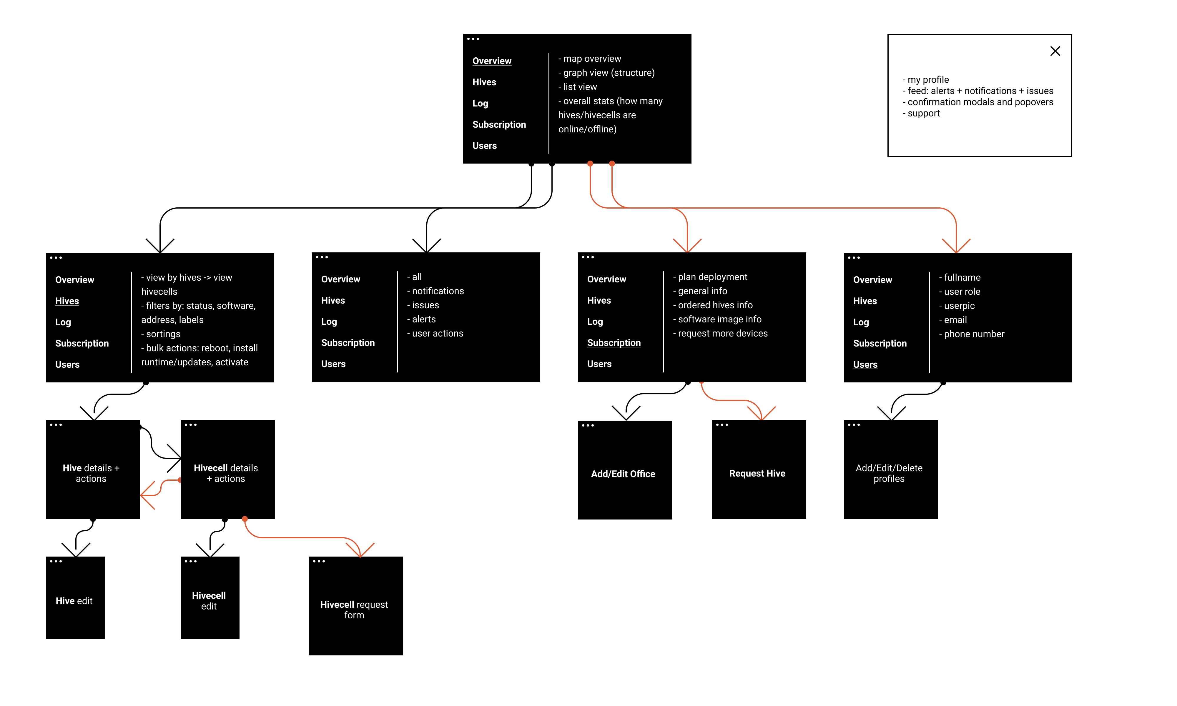
I prefer to start building wireframes or high-fidelity prototypes having a clear understanding of the general approach for the navigation, used entities and their attributes.
Moreover, it’s crucial to prioritise the information on this step, validating if our solution reflects user and business goals.
For this purpose, I made detailed information architecture visualisation. In particular cases, it works fine as a good alternative for wireframes.
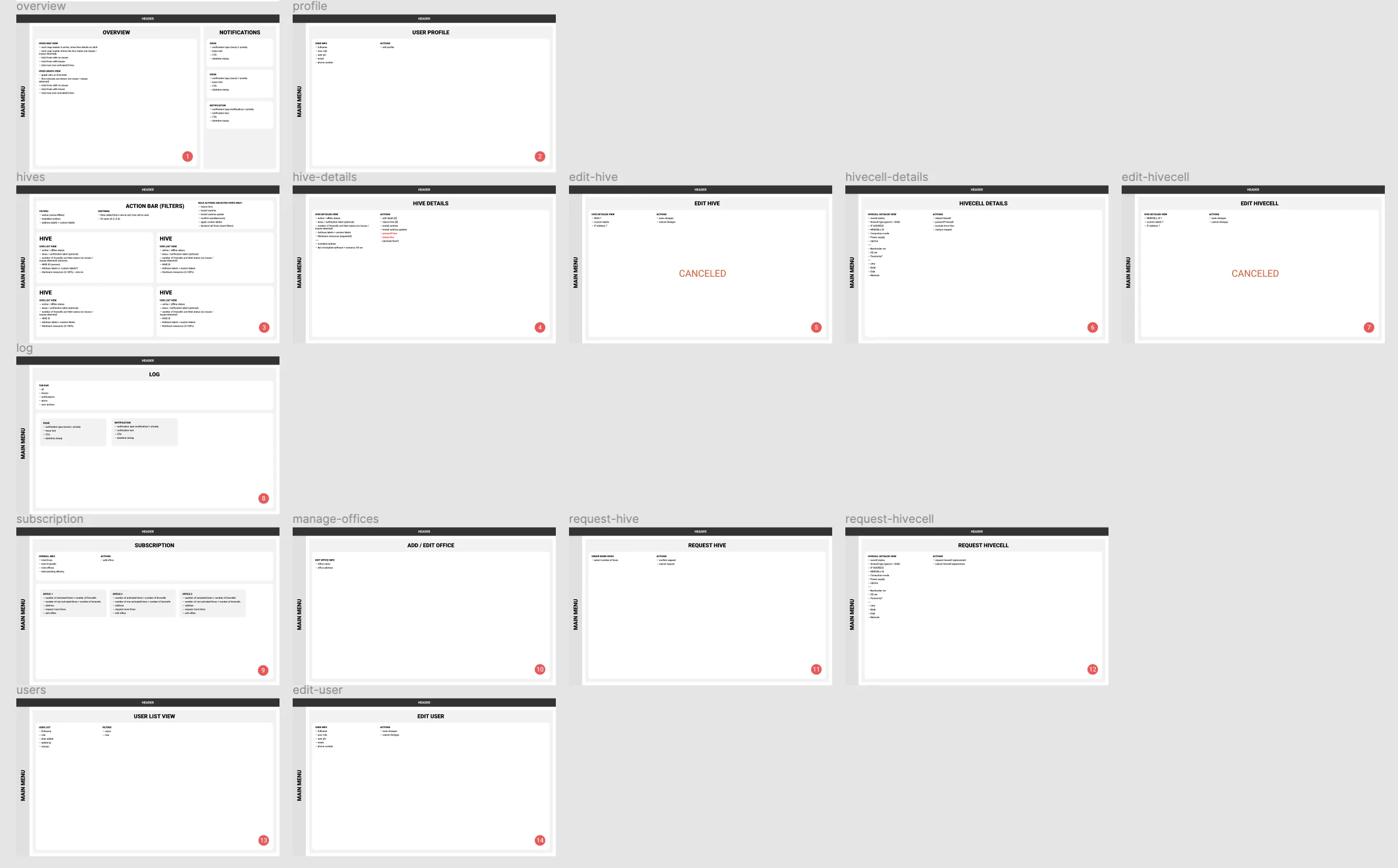
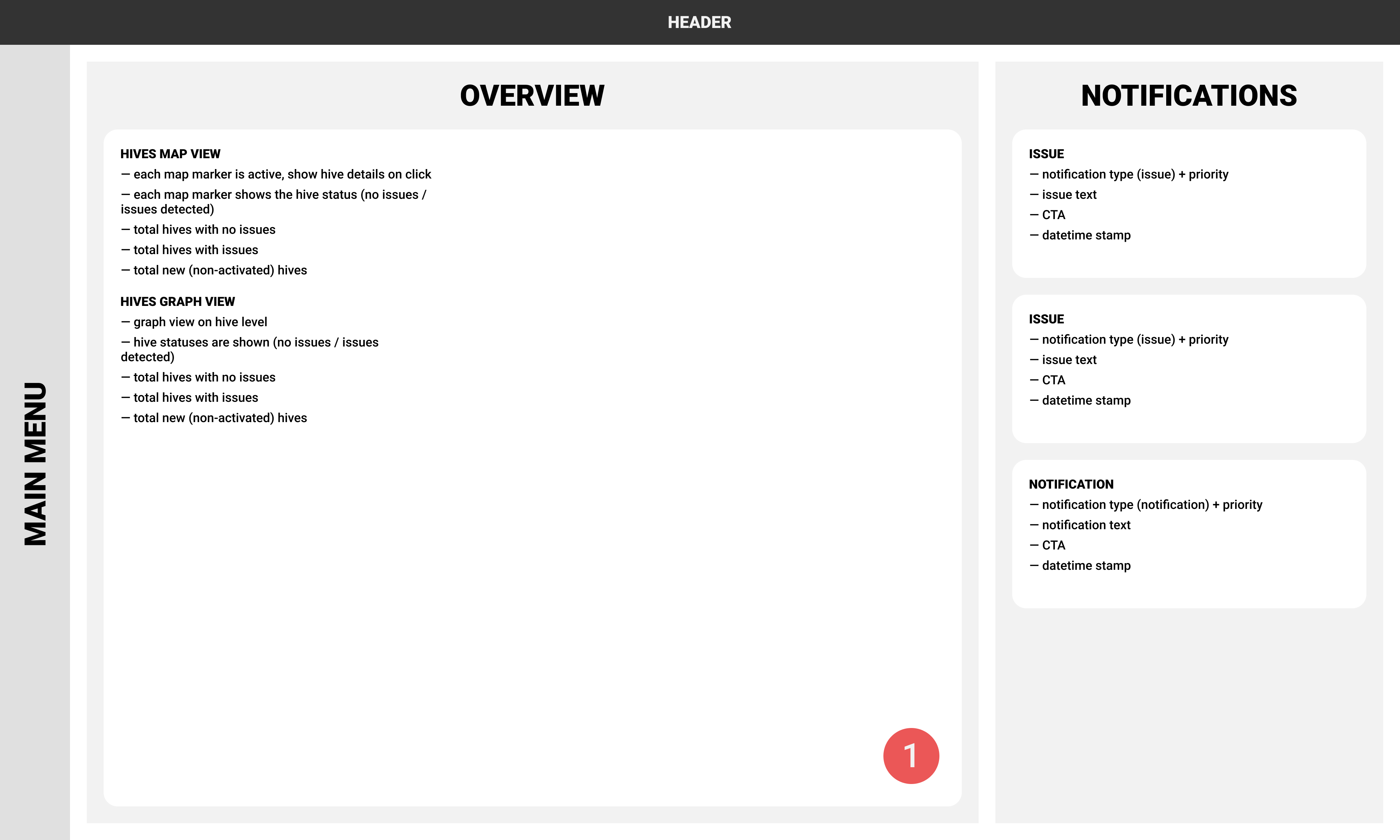
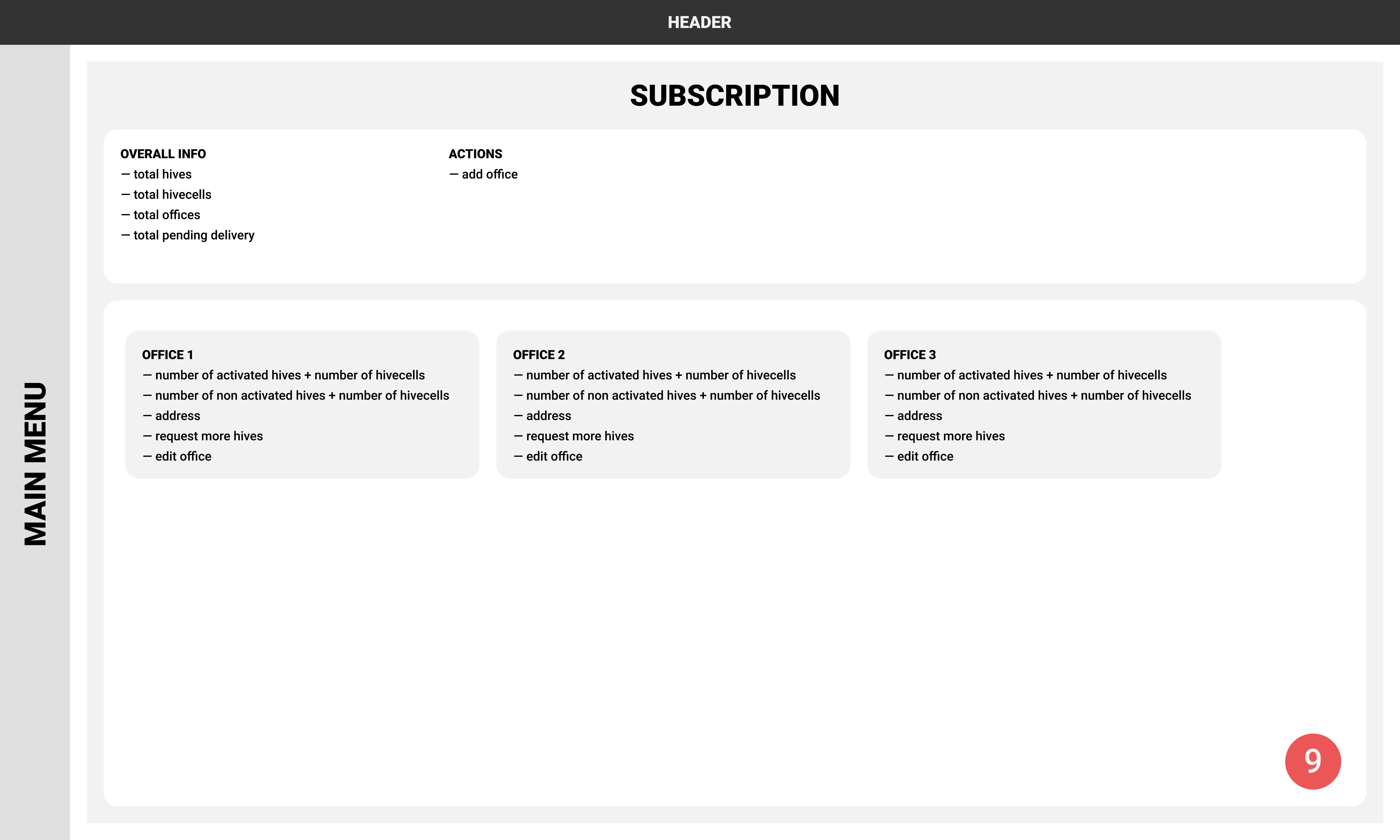
All screens had numbers, so on this step, we had several workshops mapping scenarios with the proposed structure. This exercise was beneficial because we constantly noticed room for improvements and were able to implement changes instantly.
Prototypes
We scoped in two modules for the implementation. Overview and Hives sections covered the most critical needs — the visibility of the network, notifications engine and bulk actions.
Additionally, we agreed to test prototypes, so I created responsive prototypes. It was pretty challenging to apply proper interactions due to the limited timeframe, but I believe it was helpful during testing sessions.
General approach
There is always a massive gap between desired solutions and authentic experience. The overall design flow might seem quite linear from talks to designs, but there were constant backs and forths on all steps in real life.
Insights from the client or recommendations from the development team challenged us to re-think proposed solutions.
Overview
The Overview module is available for all user roles. We had dozens of ideas regarding the visualisation, and for the first release, we decided to go with the map view.
When several clusters go offline, it is essential to see if they are nearby. It’s the quick way to get the direction of problem investigation for the engineer.
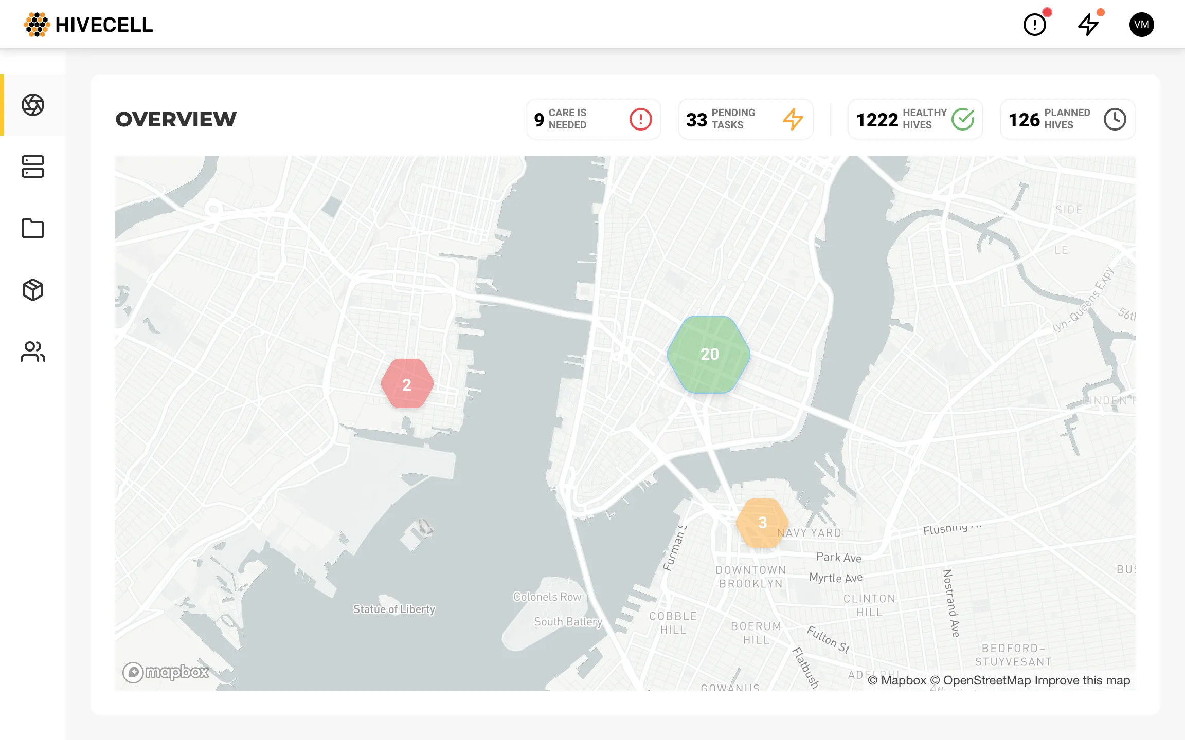
Quick filters for map pins and collapsible menu, making work area as huge as possible.
Notifications
There are several points we need to know about notifications:
- We don’t create a new notification for every single event in different clusters. Instead, we stack notifications of the same type.
- Clicking on certain notifications, we are redirected to the Hives section with a filtered list of preselected clusters and predefined bulk action.
For example, we get a notification about available runtime deployment on 100 devices. Clicking that notification, we will be redirected to the view where all these devices are preselected as well as a relevant bulk action.
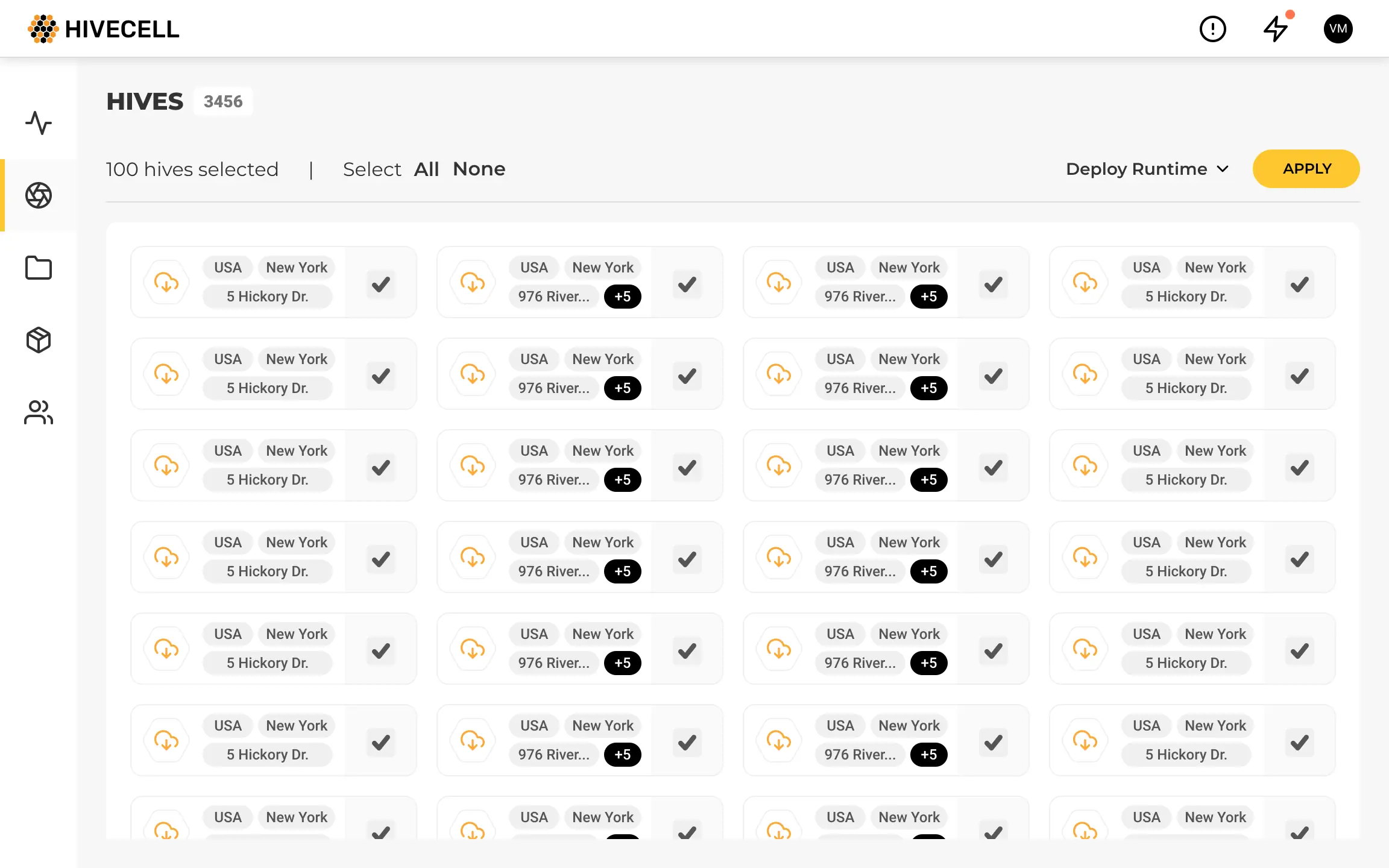
Hives
At the same time, it’s possible to get detailed information about any cluster and node, apply bulk selections and actions in “free mode”.
Not all assumptions worked as expected
Constant testing helped to avoid irrelevant ideas. For example, my initial thoughts about the Hive list item.
Having in mind existing tools, I was too concentrated on the granular level trying to display detailed information about nodes within each cluster.
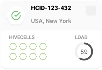
My biggest concern was data fetching. Even with proper pagination and cache, it was really tricky to implement in the actual system.
However, the feedback we received eliminated my concerns. Users just didn't need to see such detailed information about each cluster. It was enough to know primary statuses like “everything is fine”, “update is available”, “the problem discovered”.
One more idea for the list view was content grouping. I assumed we should prioritise the hives list due to issues importance.
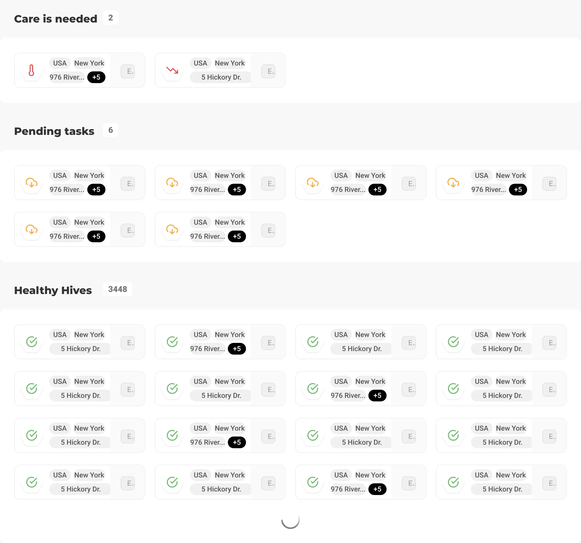
At first glance, users were fine with that view. However, they were struggling if any filters were implemented. The sorting also could work for each group internally, which was a colossal price for the grouping.
I believe this list view might get back as an option in the future, but we had to be as flexible as possible for the first release.
Outcomes and lessons
I was thrilled that I worked on this product. For sure, it was the very beginning from the implementation perspective, but the main goal was achieved successfully. We got many insights about users, created a vision of the whole platform and prepared a solid foundation for further releases.
The methodical approach, Ivan used, helped to structure all the stakeholders’ vision into the system , which could be easily decomposed into components and taken into further work. UX concept validation decreased the feedback loop and helped to prove we are moving into right direction. Our partnership with Ivan was very productive and has laid a foundation for further UX strategy development.
Julia Titova, Hivecell Software development lead
It was a pleasure to work with the team who did their best to provide information about devices, proper people for testing, and were always open to suggestions.